On this page
SuperCharge Design System
Amazon Web Services
A flexible base design system that saves 3 weeks of design time for each project for consulting teams
My Role
Product Designer
My Contribution
User Experience Design, User Interface Design, Prototyping, Design Advocacy, Design Ops
About the Team
Myself
Year
2021-2022
Platform
Figma
Time Frame
6-8 months
Problem Statement
Having worked on multiple products (without centralised design support), one of my biggest challenge is to quickly dive in into user flows and prototyping without worrying too much about low level design. Often, what might happen is wasting time designing from scratch or spending time looking and cobbling together some random components. I want to spend more time on the flow instead where the return of investment is the highest in terms of user experience.
In order to work more effectively, a good flexible base design system must be in place. Like how the creators of Tailwind CSS puts it in their book “Refactoring UI”...
— Tailwind CSS CreatorsThe more systems you have in place, the faster you'll be able to work and the less you'll second guess your own decisions. You'll want systems for things like font-sizes, colors, borders etc. and anything else you run into where it feels like you're laboring over a low level design decision... try to avoid having to make the same minor decision twice.
At AWS Professional Services, the consulting arm where I am based, designers lack a non-opinionated minimalist design system that I can quickly leverage and work from. The internal Polaris Design System is designed for AWS console and was hard to customise towards the clients branding. Many of the consulting projects are only few weeks long, and we often rush into development. Design must always ideate, prototype, test and be ahead of development, and this means that if I can go through my cycles at a faster rate and at a higher fidelity with less effort, I will be able to uncover more insights and communicate with dev teams and clients earlier and more effectively. Hence, I repurposed a design system project, initially intended as a personal exploratory project, into a multi-brand starter design system.
The Solution
I created a flexible base design system to serve as a starter system to give designers a headstart and supercharge designers working in multi-projects, fast-paced environment that suits my work flow with semantic global styles and commonly used components.
Process
I studied and referenced other design systems such as Carbon (IBM), ADS (Atlassian), Apple Human Interface Guidelines, Material UI (Google), Ant Design and many other brand agnostic systems such as Tailwind UI, Untitled UI, Shipfaster UI, UI Prep.
Timeline
Research and Discovery
As part of self-learning, I studied multiple design systems and collected styles and components in a GitBook for reference. I also researched about how people create typographic systems and color systems.
Design and Ideation
I design and create the components in Figma and test if they made sense in different states and scenarios. I practised my typography skills and took Shift Nudge, a UI course by Matt D Smith. In July, I joined AWS as a design architect.
Prototyping and Testing
While working on my consulting projects at AWS, I saw the opportunity to test the design system and the components. Some of the projects were dashboard, data tables heavy, while others had forms layout to test my input types.
Design and Test
As I explored with more projects, I got better understanding of how best to structure components. I continue to test and improve the components over time across multiple projects and update the system with latest Figma features as good practice.
My Role
I worked on this project alone while working on my other projects at AWS and use the other projects as test bed for hardening this design system.
This concept of a brand agnostic design system is not new and there are a ton of great design systems out there where I can leverage and just use. I tried them but I like some parts of each, and didn't like some parts of each. For example, like how many color stops and what is their Saturation and Brightness, how some variants are not the way I want it, how components are structured, or how certain elements look etc. In the end, I decided to give making one a shot and the more I try, the more I learn and the more opinions I have about how things should be set up.
Fun Stats
Guiding Principles
Consistent and minimalist Design Language
Constructed based on design principles such as contrast, balance, proportion, hierarchy, repetition, alignment, white space and Gestalt principles like law of similarity, proximity, etc... to create visually appealing and functional design.
Tried and Tested UI and UX Patterns
Many design patterns that are present in today's apps are heavily tested by users to arrive at its current state. I consolidated user-friendly patterns across these widely used systems and incorporated them.
Dogfooding my own Design System
I must be able to use this design system for my own practice and workflow. To date, I have tested this system to design and redesign 4 products and multiple presentations.
Continuous Iteration and Improvements
I have rebuilt this system twice after learning from my mistakes around component structures such as having a base master component with many hidden layers.
Learning from the best
Building this design system gave me the opportunity to study industry's best design systems in depth and practise my design skills deeply, systematically and rigorously.
Taking advantage of latest Figma's feature
Leverage Figma's updated feature such as Autolayout 4.0, Variants and Community Plugins so that I can continue to learn the fantastic tool and stand on the shoulders of the talented community.
Main Features
Solid base building blocks
Carefully crafted commonly used base atomic components such as buttons, inputs, badges, data cells, dropdowns in different variants, sizes and states to be easily swapped in complex web application designs.
Customisable Global Styles
Built with soft 4px grid system, extensive scalable typographic system, semantic 11-steps color system and effect styles. These can be customised to any look and feel and the components will be updated with the new look.

Ready to use resources
Preloaded with popular icon libraries (Feather Icons, Box Icons, Hero Icons and more), royalty-free avatar stock photos that represent people from diverse cultures and logos of familiar brands to allow for immediate use.
Challenges
Limited feedback and testing
As I am doing this alone and testing this within the boundaries of my own knowledge and users of a couple of projects, I am aware that many of these are not fully tested and will need more testing continuous improvement.
Propagating Adoption of Design System
The team was globally distributed and do not work on same projects. It was difficult to convince the other designers and teams to try it out when I am still developing the design system and have yet to work on the documentation and test with other designers about the usability of the design system.
Lack of Component Library in Code
I couldn't convince the developers to try building this library but I experimented with utility-based CSS systems, Tailwinds on my own. It is highly configurable. By setting up the color, text and spacing, shadows, borders styles etc, it is definitely possible to create this design system or leverage on a React component library such as Chakra UI which is based off Tailwinds.
Justifying existence of design system
Figma was not widely adopted within the Professional Services organisation I am in and many of the designers are still working on their own. In a larger context, I needed to advocate importance of design and research in the product development process to non-practitioners before I can even sell the value of the system.
Next Steps
Dynamic Color Styles Generator
I am prototyping a color styles generator in React that is based on the HSB color model to help dynamically generate in exportable Hex codes, CSS variables and design tokens configurable file.
Dark Mode Support
I designed mostly in light mode and increasingly UIs needs to have dark mode support to cater to users who prefers dark mode. I am still learning how to design for dark mode and hope to configure the design system such that it is possible to switch to dark mode.
Designing for accessibility and WCAG compliant
I tried to design my component states suitable for color blind scenarios with additional distinguishing visual elements but I have yet to test my color choices against a contrast checker in depth to make sure that the darker colors against the light backgrounds are definitely rated AAA compliant. A lot of designing for accessibility requires testing on the frontend with people of different access needs and on devices and scenarios.
Setting Up Design Tokens
The current design system is not built on a centralised design token configuration file concept. This means that I can't change a single 'base-border-radius' or 'base-spacing' to change the look and feel of the entire design system, I have to change them 1 component at a time.
Component Library and Documentation
It is difficult to use the design system in full form when it lacks a ready react component library and documentations that other designers and developers can refer to and use. It will be great if I can build this or contribute to a react component library one day to inch closer to my vision.
That said, I am not naive, this will require an incredible amount of work and maintenance. Talk is cheap. It is more of a vision I guess. I can sit here and wait for things to happen but I am a firm believer of starting today and even if I don't get there as planned, I would have learnt so much more to inch closer to it.
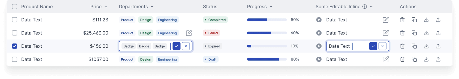
Examples
Data tables are an important component of most dashboard project. I designed the components to allow for customisation and even inline editing!
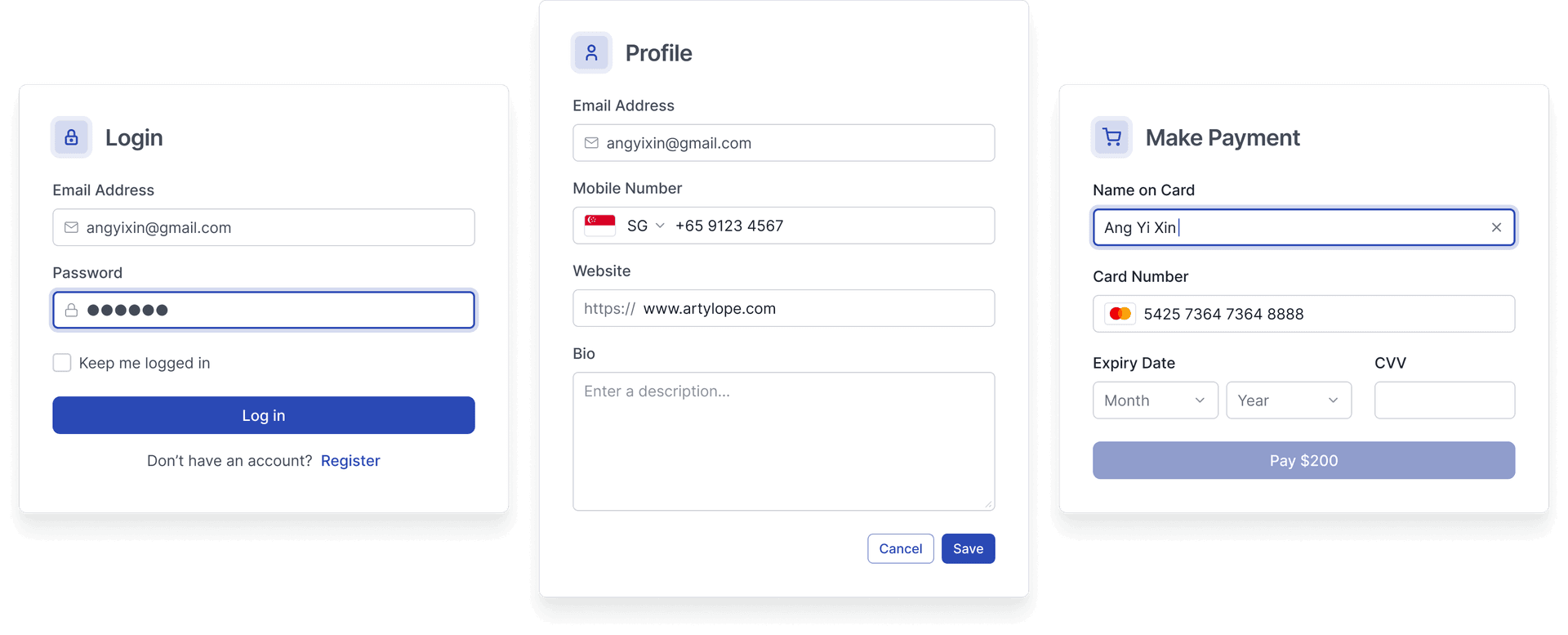
Inputs and buttons are basic atomic components of any UI. Here I used the components to quickly create a simple login and signup form.
Outcome
I decided to tender my resignation at AWS and didn't manage to advocate the use of the design system further.
When I announced my resignation to my co-workers at AWS, I found out that there was other effort to develop a brand-agnostic component library by a team of engineers who were prototyping solutions on behalf of customers and they had needed a front-end React library from an engineering point and this would have been a great collaboration opportunity. Oh well, life is such.
But this design system has been critical in my workflow for the past year, I use it as a starter for all my design projects.
Learnings
I learnt and drilled so much of my design skills through this design system. And I will continue to work on it on my own time. I also realised the success of a design system hinges on the people-team dynamics, support from managers / developers etc.
Personal Opinion
And this is a just in case... a personal opinion if the endless Linkedin-esque arguments about UX ≠ UI comes up yet again.
— Yi Xin (myself)I completely get the idea that UX is not UI and my intention is not to replace important discovery and research phase about user needs and problem we are trying to solve by fudging with a nice looking user interface. In fact, this design system serves the purpose of opening up more discussion about solution fit with users through prototyping and testing, and give time back as I get the repetitive, time-wasting part of low-level design out of the way.
I don't enjoy having those discussions about the role definition of the different design titles, or whether it is too early to introduce high fidelity mocks during ideation phase. I have tried and these discussions are pointless as we are still having it in 2022 after all these years. I decided that don't want to find reasons to not improve my UI visual skills. I just want to be the best I can be all, I want to be good in UX, UI and even front-end if I have the time. I am just happy and grateful that I have some time and tools these days have improved so much to afford me such an opportunity. I have come across too many process/research heavy projects at organisation with low UX maturity that cannot afford time for development for design systems and having something like this to fallback on repeatedly provides great foundation.