On this page
Parking.sg
GovTech Singapore
A mobile app that allows motorists in Singapore pay for parking charges at all coupon-based public car parks
My Role
Lead Designer
My Contribution
User Research, Prototyping, Wireframing, User Testing, User Interface Design,User flows, Trial Set Up, Product Strategy, Product Management
About the Team
8 people in total, 3-4 at any one time, 1 Product Manager, 2 Developers and 1 Product Designer
Year
2016-2017
Platform
iOS, Android
Time Frame
8 months
The Problem
Motorists in Singapore have to tear pre-paid paper coupons to pay for parking in some public car parks. They will need to tear many pieces if they were to park for a long period of time. If they want to extend parking, they will have to run back to their vehicle to tear more coupons. It is an outdated and cumbersome solution.
We wanted to develop a digital parking system that can replace the paper coupons, to give citizens the convenience of being able to pay for parking easily and extend parking remotely.
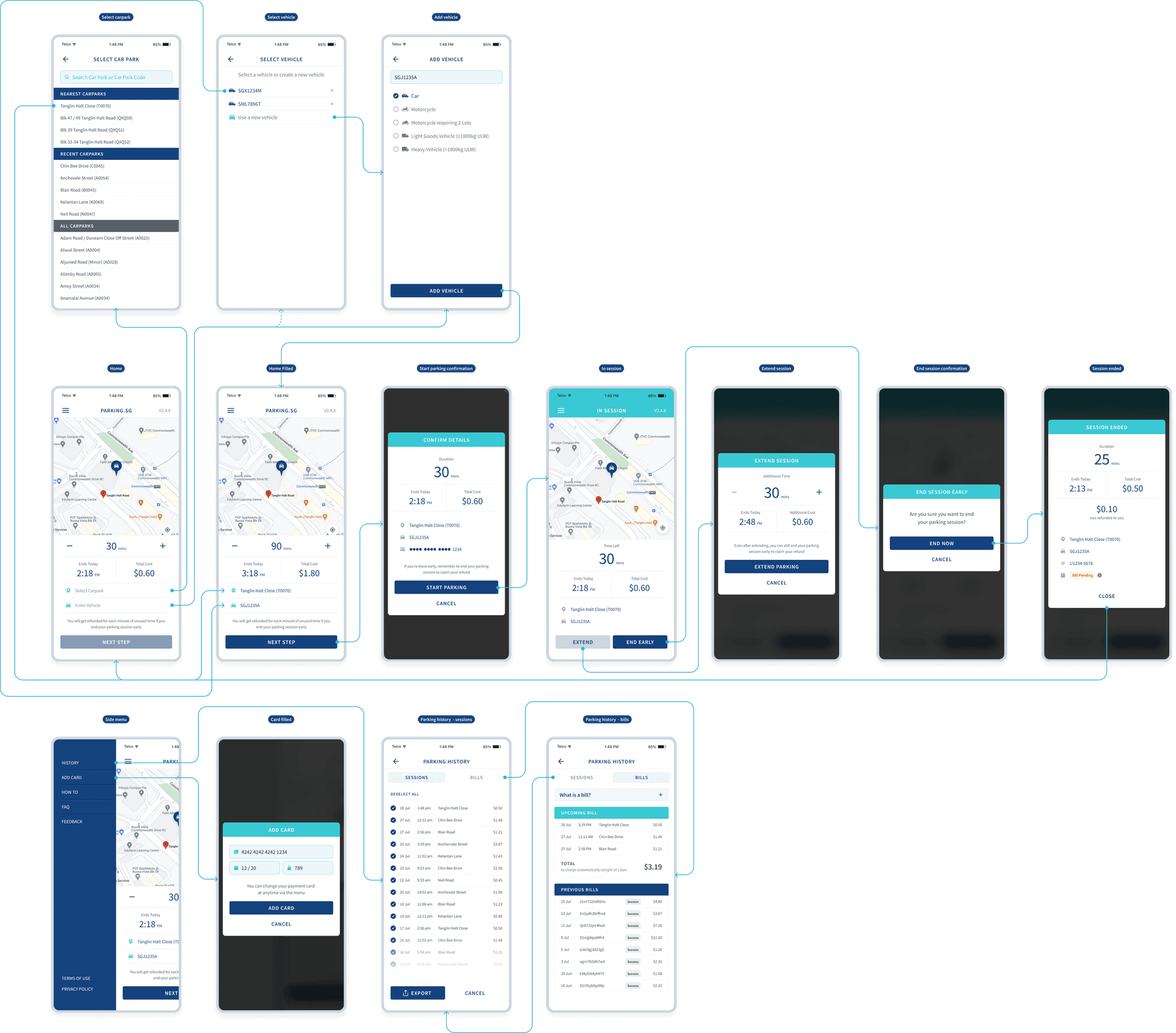
The Solution
In October 2017, we released Parking.sg, a mobile app that allows motorists in Singapore pay for parking charges at all coupon-based public car parks. The app has these 3 main features.
Impact
As of November 2018, less than 1 year after its beta launch, we achieved
My Role
8 people worked on the project in total, 3-4 at any one time (i.e. 1 Product Manager, 2 Developers and 1 Designer) We also worked with public servants in car park operations at the various government agencies. I did most of the ux and initial ui design work. Sarah Salim, a fellow designer, defined the overall visual design. I also did the user research and testing and product management and stakeholder management.
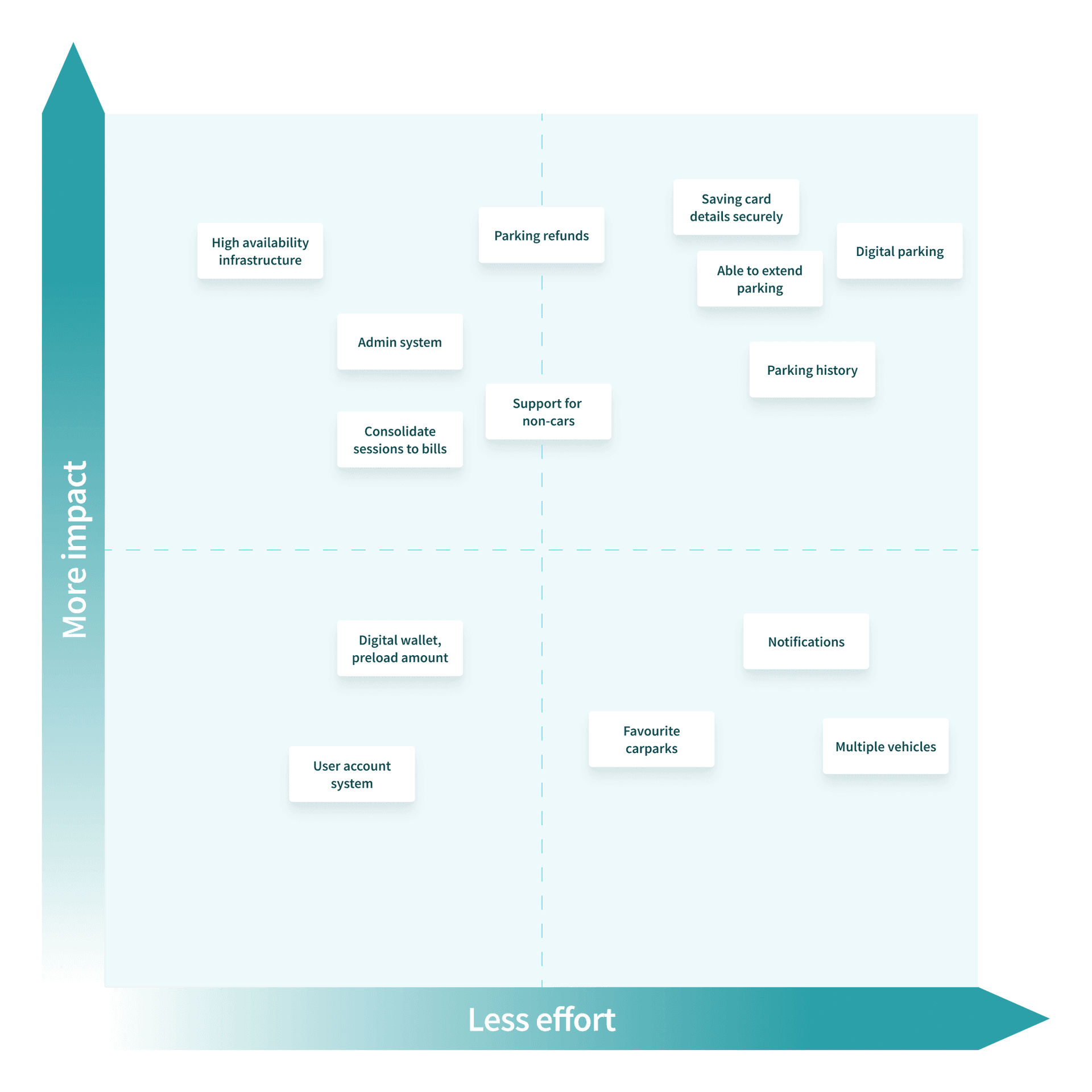
Feature Prioritisation
There were many features we want to consider, but some will take more effort and some will have better return of investment of effort in terms of benefits to the users. We plot them on an Impact vs Effort matrix to help focus our attention on the most important features.
Key Product Decisions
There are some key product decisions that are quite unique to this app
No User Accounts
User accounts has very little value add in the case of the parking app. Sure, we lose the ability to track parking history on different phones, or possibly the potential of digital wallets, but for this app to have high adoption, we need to reduce the barrier of entry. This also makes it easier for visitors to Singapore to download and use the app immediately. Unlike other types of consumer apps where we want to optimise screen time and loyalty, Parking.sg is designed to reduce as much interaction as possible to make it trivial for users to download and use.
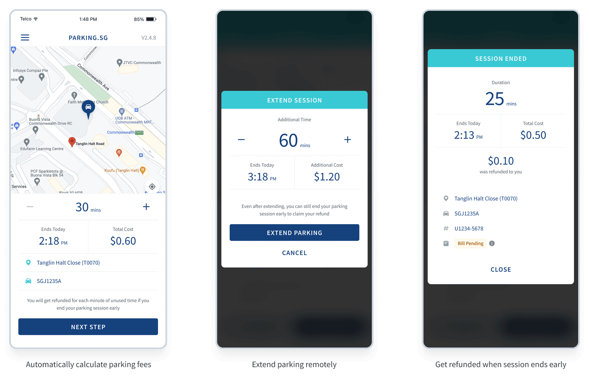
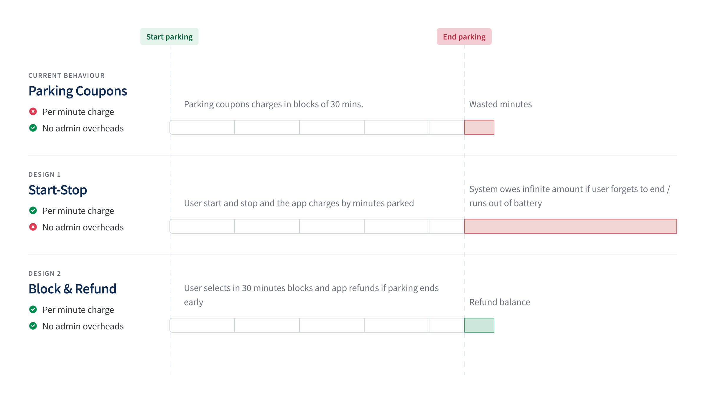
Block-Refund Charging Mechanism
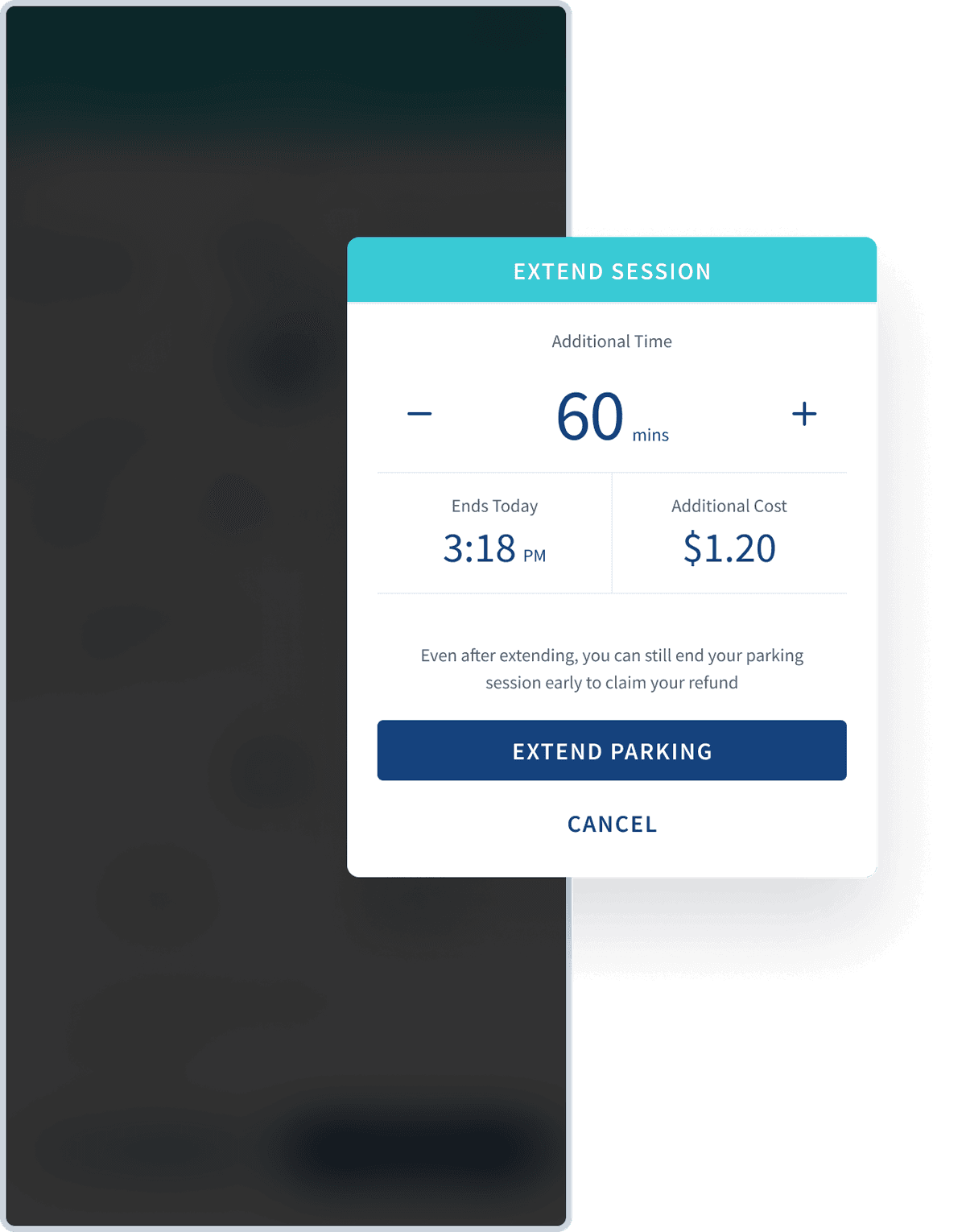
We wanted to implement a charging mechanism that is fair to the user. User should only pay for what they park, unlike the parking coupons that charge users in 30 minutes block. There are 2 ways that this can be done. As illustrated below, the block-refund design gives user the benefit of per-minute charging.
Another incentive of this design is that we will not need to implement additional admin systems to perform refunds if users forget to turn off their phones.
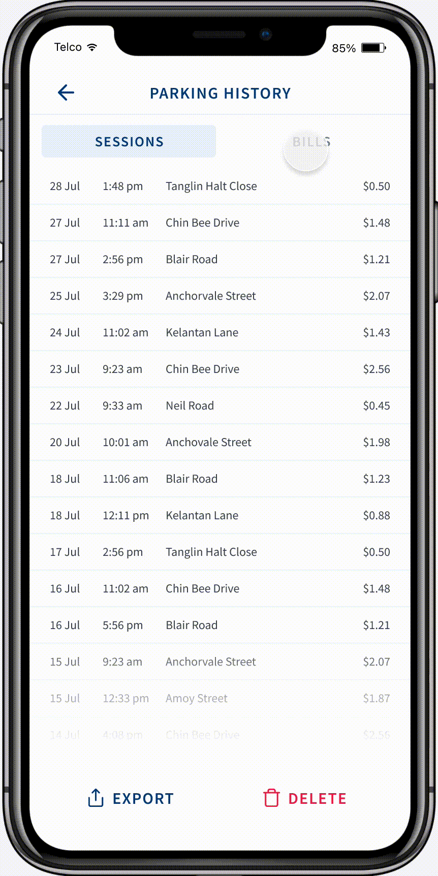
Consolidating Sessions into Bills
Most parking session on average is around an hour which means it cost $2.40. Administrative cost to the payment gateways will be high per transaction. To reduce this cost, we implemented a batching system that batches sessions into bills. This is a more complex concept to educate the user. They must be able to associate sessions to bills.
Key Design Decisions
Here are some key design decisions that we keep in mind when designing the parking app.
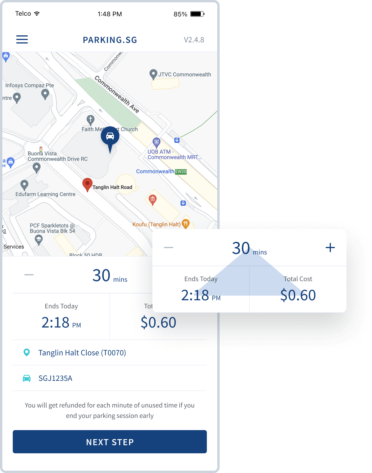
The triangular Duration-Time-Cost Structure
This is a visual model about how the parking rates are charged that is repeated in many screens to create familiarity and visual distinction that is unique to this app.
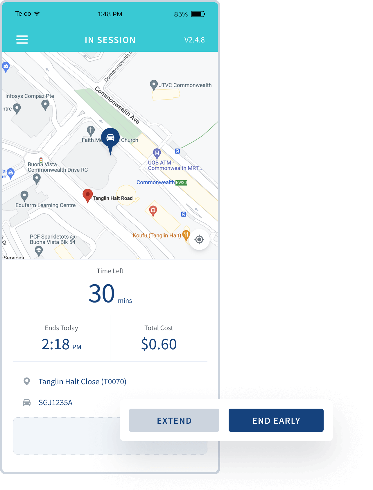
Main call-to-action button is always at the bottom
This creates consistency and users do not need to think too much what they are required of. If there is a secondary action, it will be displayed as a link so as not to distract the user.
All transient screens are presented as modals with overlay
This subconsciously reminds the user that they have yet to complete their current action. This is especially important as our screens looks simple and similar due to the triangular Duration-Time-Cost Structure and a call-to-action button that repeats itself across screen which encourages change-blindness.
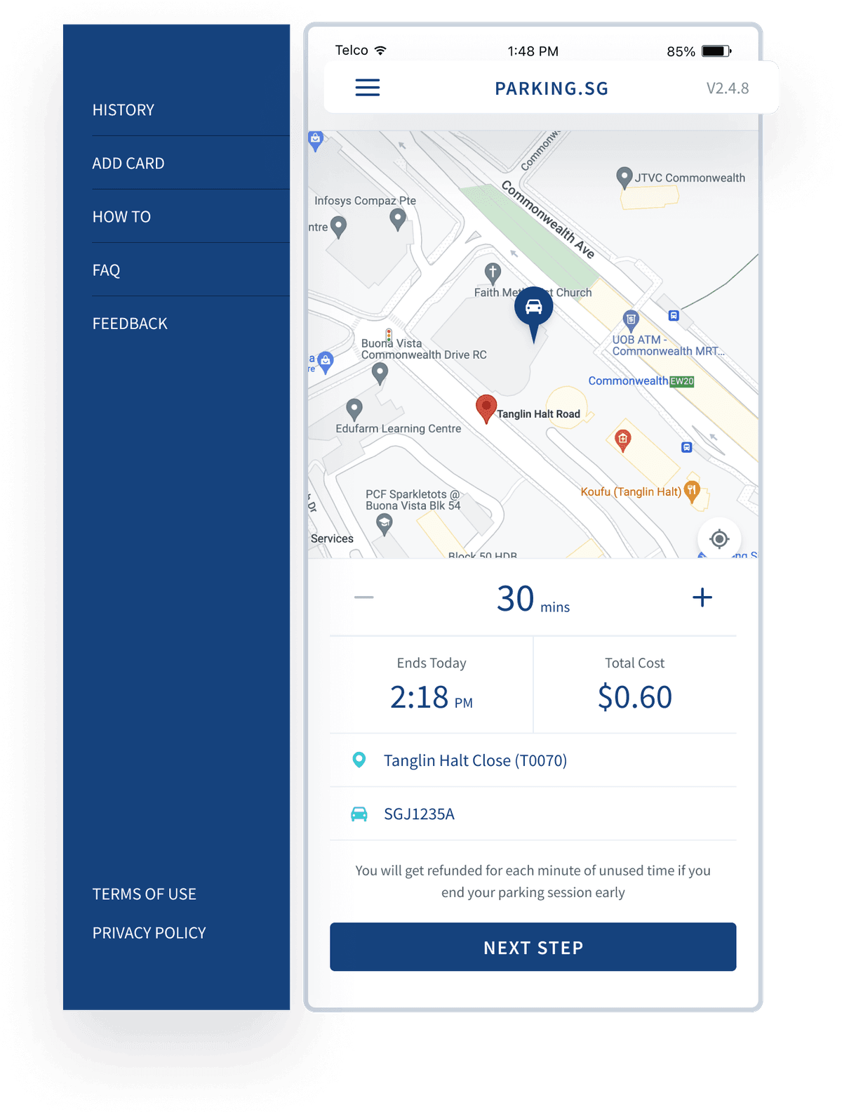
Parking is the only main action
This makes side menu a good solution for navigation vs the bottom tabs menu. User is only presented with the screen to start parking. Everything else is hidden in the side menu.
Research & Testing
To ensure our parking solution met user needs, we conducted comprehensive research including ethnographic studies, user journey mapping, and early prototyping with real users.
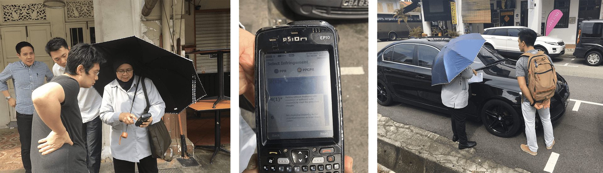
Ethnography Study with Enforcer
To help us understand how we can design the system to integrate with the existing enforcement process, we walked the ground with the enforcement officer. She shows us the electronic handheld device (EHT) that she uses to check for season parking information. She also uses it to issue summon. Since she already has this device, we need to find a way to send the real-time digital parking data to her.
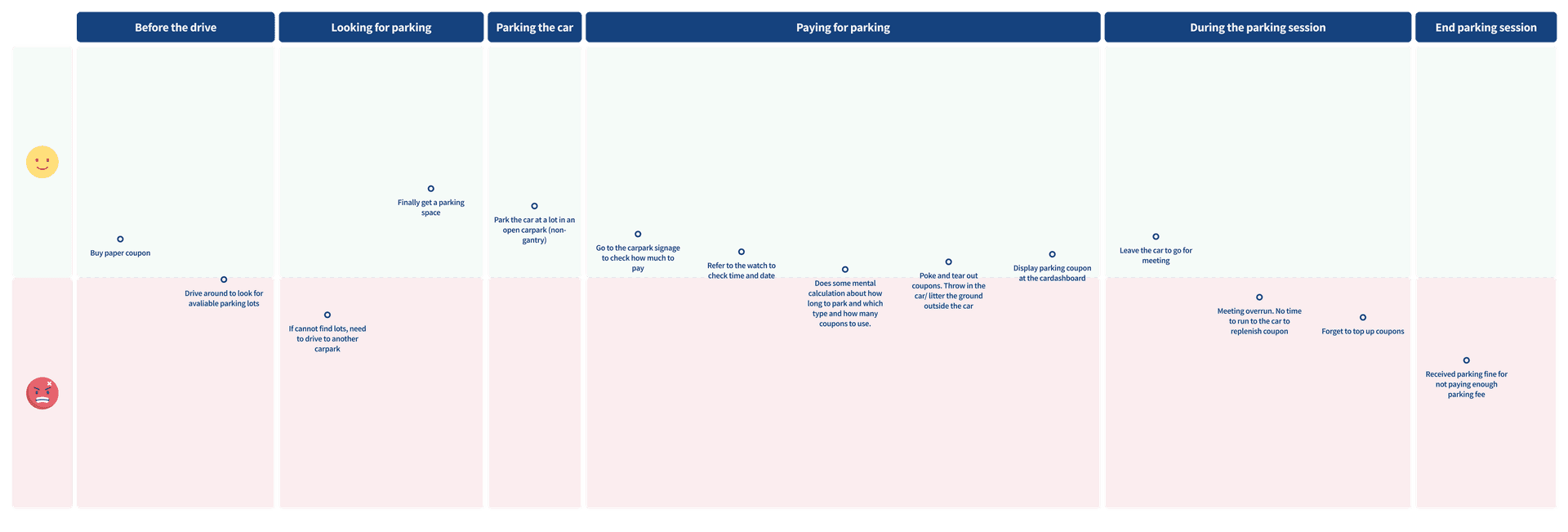
Mapping the User Journey
In late 2016, during the discovery phase, I prepared the following interview questions and interviewed 5 people who drive and uses the parking coupons.
With that information, I plotted this customer journey map to visualise the highlights and pain points of a motorist's parking journey. Looking for parking and paying for parking create the most hassle for the user. And that is what we want to solve.
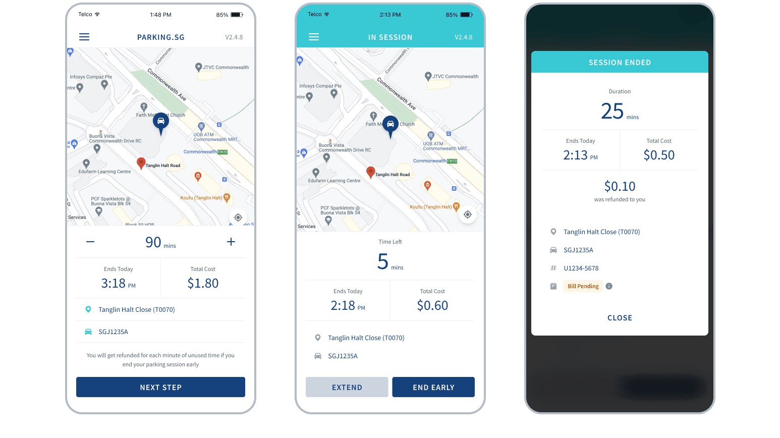
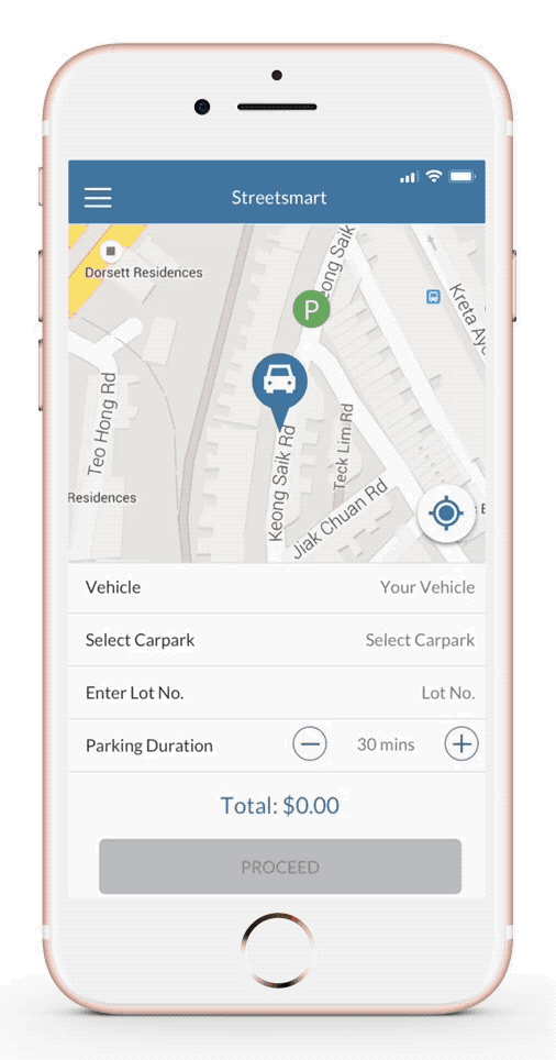
Early Prototype and Guerilla Testing
With all the discovery and learnings from above, I made a prototype in Sketch and InVision and brought it out for some users testing based on designed tasks scenarios. The following mock up is a few iterations after these testings.
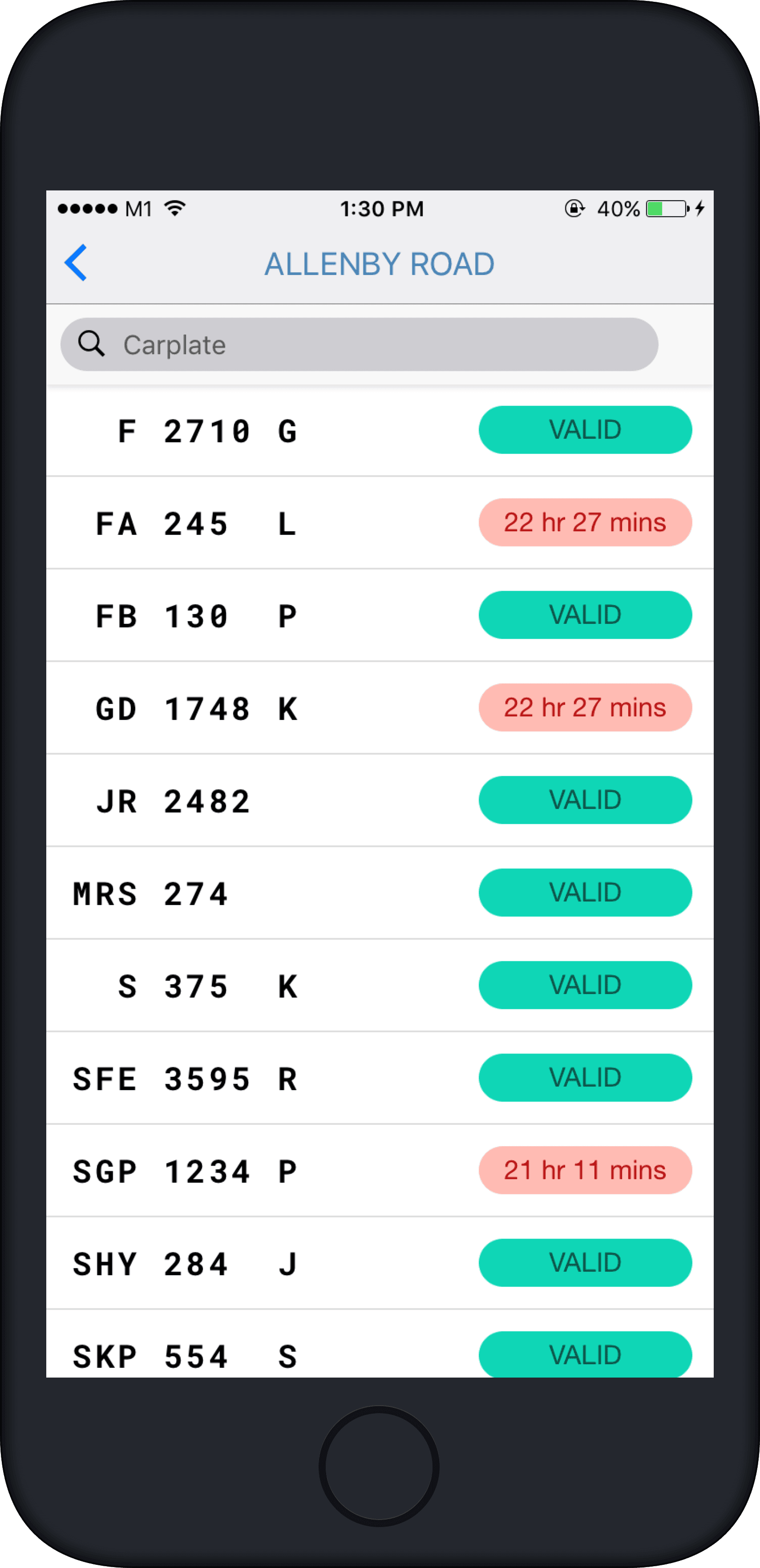
Enforcer App
Based on the design, we made a working prototype with a simple backend so that we can work with URA and HDB (the agencies that manages car parks) to do real parking sessions with actual users at a real carparks. We also made an enforcer app and trained enforcers to use it so that they can enforce the cars that are paid digitally before the digital parking system is integrated into the EHT.